
Your website is already a product video
The headline, the product and the proof are already on your homepage. Most product videos start from a blank page anyway. Why that’s backwards.
Sep 26, 2026
A centre crop from 16:9 to 9:16 throws away 68% of the frame. What platforms ask for, what cropping destroys, and how to make one video work in three shapes.

Most vertical versions of product videos are made the same way. Someone takes the widescreen master, drops it into a 9:16 frame, and crops the sides. It takes a minute. You can almost always tell.
The headline runs off both edges. The product sits in a thin strip in the middle of the phone with nothing around it. A two-column layout becomes half a column. The problem isn’t the editor’s care. It’s arithmetic.
A 16:9 frame at 1920 by 1080 pixels is wide. A 9:16 frame is tall. If you keep the full height of the original, a vertical crop is 1080 pixels high and 608 pixels wide.
That’s 31.6% of the original width. A centre crop from 16:9 to 9:16 throws away 68% of the picture.
Shape | Width kept | Share kept |
|---|---|---|
1:1 | 1080 of 1920 px | 56% |
4:5 | 864 of 1920 px | 45% |
9:16 | 608 of 1920 px | 32% |
A square keeps a bit more than half. A 4:5 feed video keeps less than half. A vertical story keeps about a third.
If the 68% you lose were empty sky, cropping would be fine. In a product video it rarely is.
Widescreen layouts put things side by side. A headline on the left, the product on the right. A stat in each of three columns. A table with its labels on one side and values on the other. The centre of the frame, which is the only part a crop keeps, is often the gap between the two things that matter.
Here’s one second of our example film for Attio. In the 16:9 version the headline sits on the left, and the workflow it describes builds itself on the right.
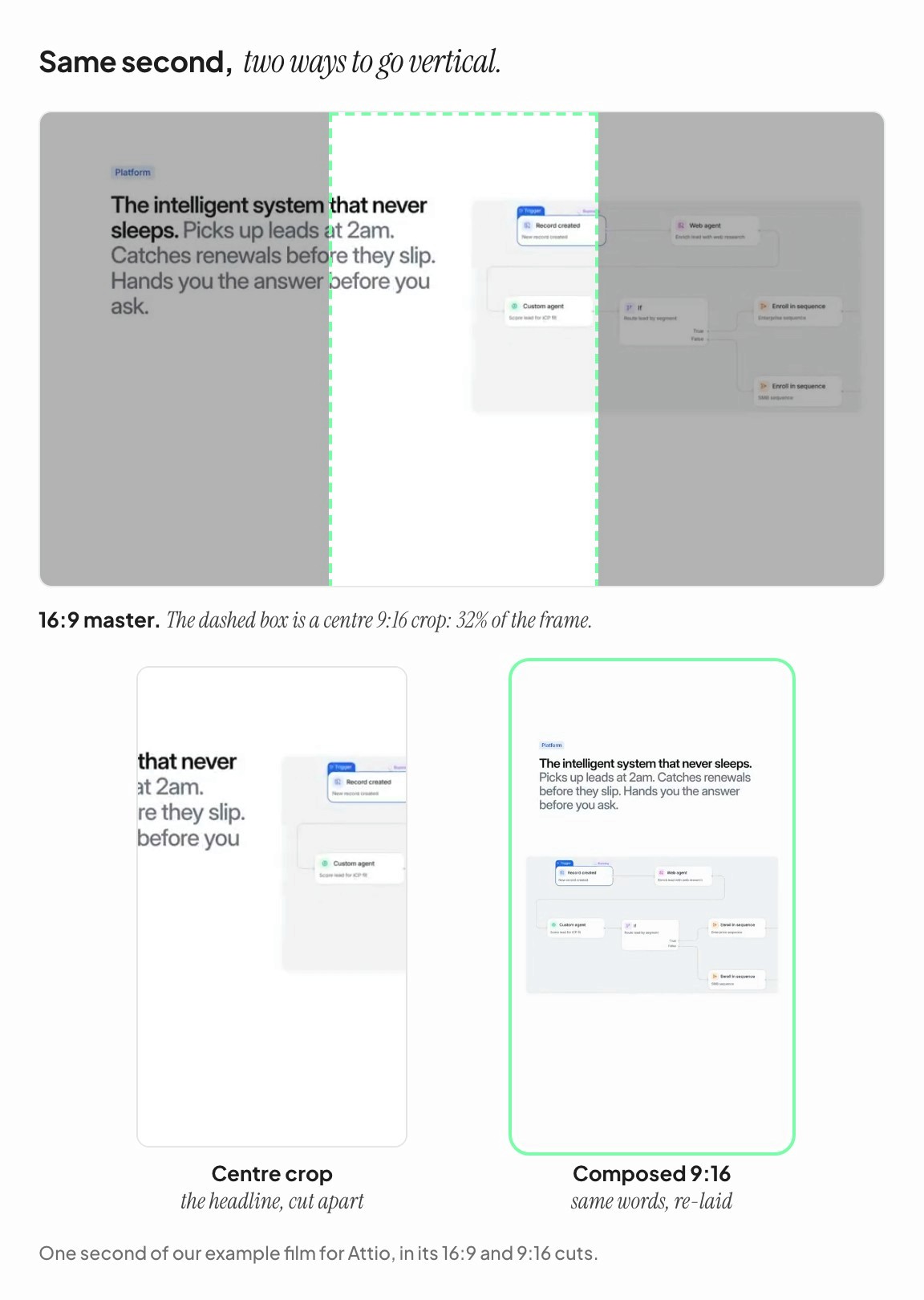
A centre crop keeps the middle third: the ends of the headline’s lines and the left edge of the diagram. Neither makes sense on its own. The composed vertical cut, at the same moment in the film, stacks the headline above the diagram and sets both at a size that reads on a phone. Same words, same product, same second, different layout.
You could argue for making everything 16:9 and letting platforms deal with it. The platforms have made their preferences clear.
Meta recommends 9:16 for Reels and Stories, and supports 1:1 and 4:5 in feeds. [1] LinkedIn’s video ads accept 16:9, 1:1, 4:5 and 9:16, and LinkedIn marks 4:5 as its recommended ratio. [2] YouTube treats square and vertical uploads of up to three minutes as Shorts. [3] TikTok recommends vertical 9:16. [4]
Vertical placements also cover part of the frame with their own interface. For Instagram Reels, Meta says to keep the top 14%, the bottom 35% and 6% on each side free of text, logos and anything important. [1] So the usable part of a vertical frame is a narrower window in the middle of an already narrow frame. That’s one more reason a crop from widescreen fails: the part of the old frame that survives the crop is partly covered by buttons.
A composed cut uses the same elements as the master, rearranged for the new shape. In practice that means a few specific moves:
Stack what sat side by side. Text above the product instead of beside it. Three stats in a column instead of a row.
Rewrite the line breaks, not the words. A headline that fit on one wide line gets broken into two or three short ones, at natural pauses. The words stay the same.
Scale for the phone, not for the frame. A vertical video is watched at the width of a hand. Type that was comfortable at 16:9 on a laptop needs to be relatively larger.
Show less of the product, bigger. A wide dashboard won’t fit. The one card or chart that matters will, at a size someone can read.
Keep the safe zones clear. Headlines and key UI stay inside the area the platform won’t cover.
Keep the timing identical. All three cuts should hit the same beats at the same moments. That way they tell the same story, and you can test them against each other without the edit being a variable.
The square cut is its own composition again, somewhere between the two: usually a stacked layout like the vertical, with more room at the sides.
Recomposing a finished widescreen edit by hand is slow, which is exactly why so many teams crop instead. The cheaper way is to plan for three shapes from the first shot.
That means building each shot from separate elements: a headline, a piece of product, a line of proof. It also means deciding, before anything is animated, how each element sits in each shape. When the edit is built that way, a vertical cut is three layouts of one edit instead of three edits, and nobody is tempted to crop.
Every VideoFold film ships in 16:9, 9:16 and 1:1, and each one is composed for its shape. You can see the three side by side on our homepage.
Meta Business Help Center, “Best practices for aspect ratios,” and the Meta Ads Guide entry for Instagram Reels video ads (safe zone of 14% top, 35% bottom, 6% sides). facebook.com/business/help/103816146375741, Ads Guide: Instagram Reels
LinkedIn Help, video ads advertising specifications. linkedin.com/help/lms/answer/a424737
YouTube Help, “Upload YouTube Shorts.” support.google.com/youtube/answer/12779649
TikTok Ads Manager Help, in-feed ads specifications. ads.tiktok.com

